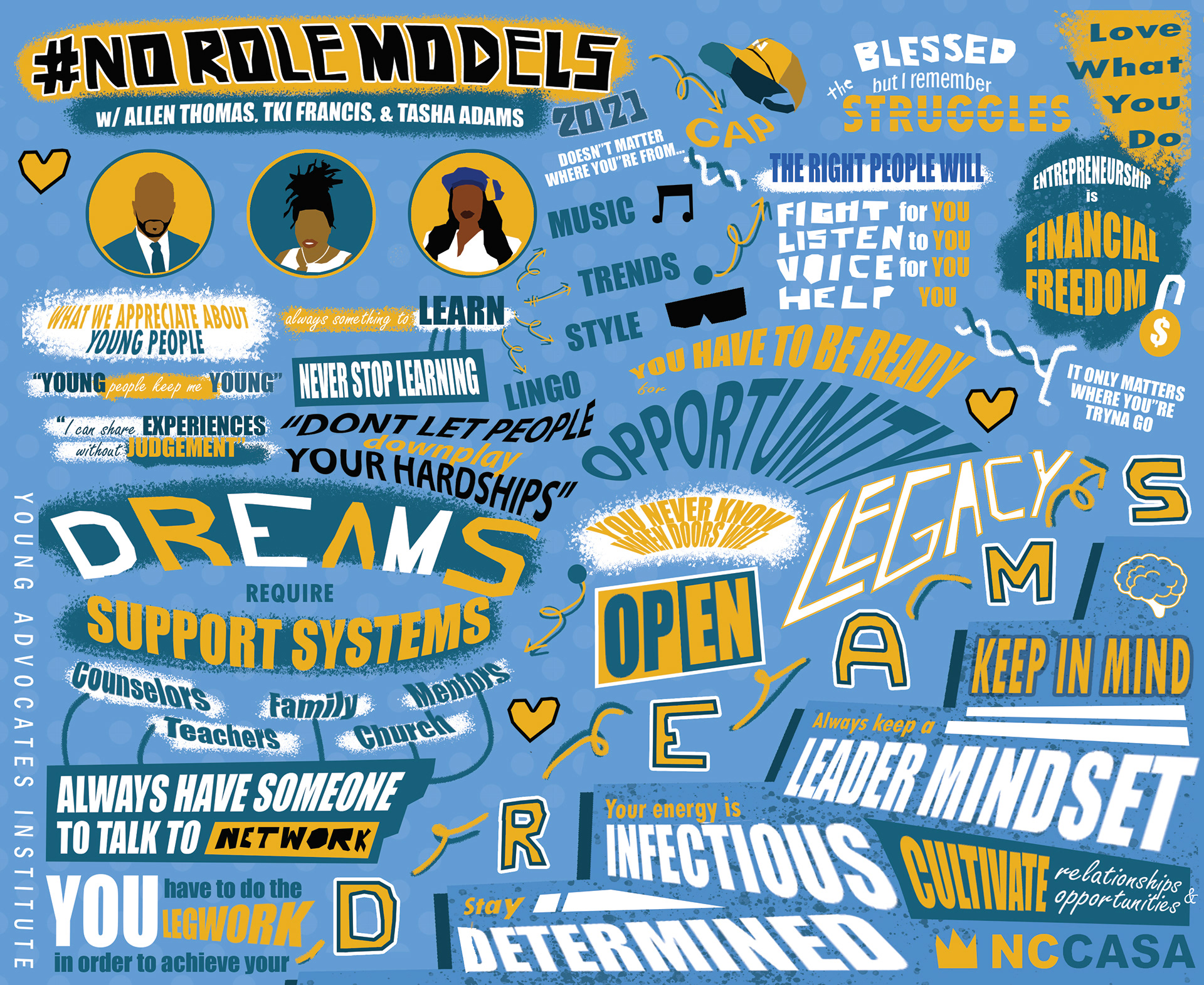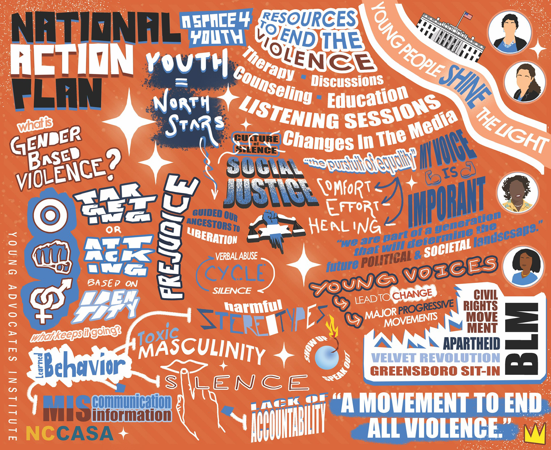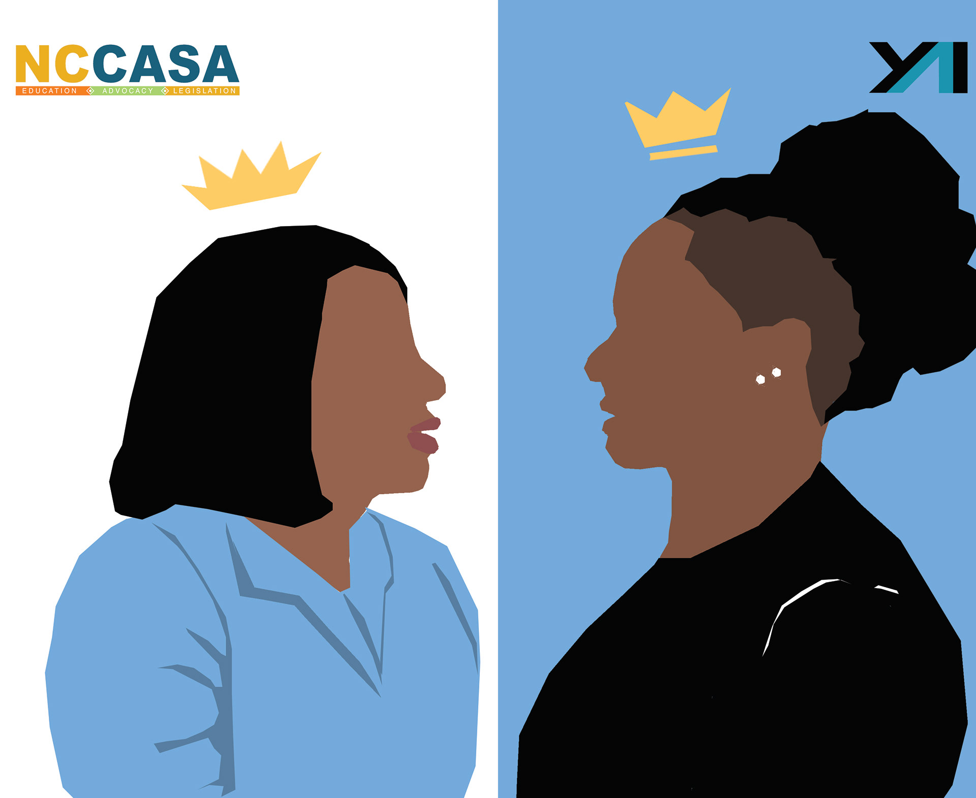
Designing for impact - advocacy through bold, inclusive visuals created for the North Carolina Coalition Against Sexual Assault.
Inspiration
- Centered on dignity, safety, and accessibility.
- Visual language inspired by community outreach posters and nonprofit campaigns that use clear typography and
human-focused photography.
- Color choices derived from trauma-informed palettes (muted but warm) to balance urgency with compassion.
Process
- Brief & research: Meet client, define goals (awareness, resource signposting), audit existing materials.
- User/Stakeholder mapping: Identify audiences (survivors, volunteers, funders) and their touchpoints.
- Concepting: Quick thumbnails and moodboards (typography, photography style, color systems).
- Comps & prototypes: Create 2–3 poster and social templates; run quick stakeholder reviews.
- Iterate: Apply feedback for tone, readability, and accessibility (contrast checks, legible type sizes).
Deliverables: Exported files — print-ready PDFs, social image sizes, and a one-page usage guide.
Design decisions & rationale
- Large, open type for readability and calm authority.
- Accent color used sparingly to draw attention to helpline/CTA.
- Layout prioritizes resources and next steps rather than sensational imagery